I’ve been using Oribi now and then, and so far and I love it. I’m still under the influence of their excellent UX, so I wanted to include the tool in my day to day to prove that can produce results.
Oribi’s home screen is the dashboard, and it shows you how many visits you’ve got in the past 7 days and the latest trends at the top.
Visits are still a vanity metric, but the latest trends are interesting. In my case, the quick overview is: “traffic is down, fewer people visiting from desktop and more people coming from the US.”
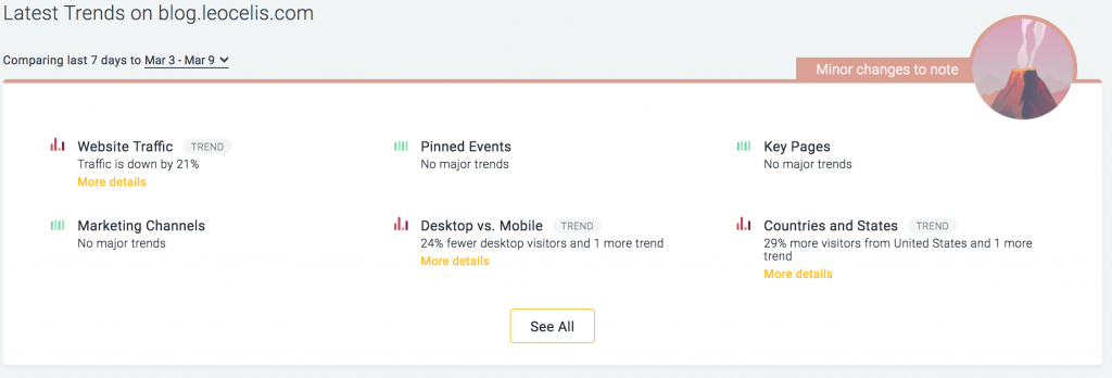
I think they can do a better job here. Instead of showing multiple icons with legends, one single line with the most meaningful highlights is enough to kick off your analysis.
Next section is Top Visitors. I’m always curious about what visitors are doing in my blog. The Visitor Journey is by far the best feature I’ve ever seen in analytics software.
It is not about tracking the users, even with a simple tracking pixel you can get that info. It is how they present it.
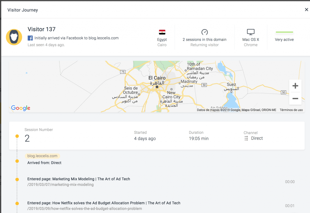
I’m not too much fan of the reverse ordering; I’d rather see the first session at the top. I do like the fact they’ve grouped the actions by sessions, and you can see a summary at the top.
You will love Oribi on the first day. They created a visually attractive way to explore your site’s data. For a first day, it’s been an ego-centered journey, the real question is: can I get any meaningful insight and take actions that will produce results?

- From SaaS to AI Agents - 05/27/25
- The AI Automation Engineer - 05/13/25
- Hire One Developer to Press One Key - 05/06/25